An interview with Erin Westenskow Berrett. Berrett is showing this month at Williams Fine Art. For comments on hers and other exhibits up this month in Salt Lake see below.
Exhibition Reviews: Salt Lake City In and Out of Context by Kasey Boone, Geoff Wichert, Shawn Rossiter
While not everything, context is something in a work of art and these three reviews of current shows in Salt Lake examine various ways in which what goes on once a work has left the studio can influence what we call "art."
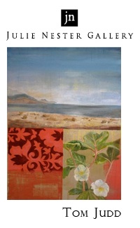
Erin Berrett and David Meikle at Williams Fine Art
The two-person exhibit is a tricky thing. It's a marriage of sorts, and we all know that though marriages can sometimes be invigorating they can also be suffocating. What drove the matchmakers at Williams Fine Art to bring together Erin Berrett, painter of still lifes, and David Meikle, artist of the intermountain landscape, is not immediately apparent. In Utah there are plenty of other still life painters who might have been more Berrett's type, and at Williams, Meikle could have had his pick of mates, living or dead, who enjoy the landscape.
Berrett comes from that school of University of Utah painters who embrace the still life as a chance to paint more than to compose. Her setup will be familiar to anyone who has been around for the past decade. A single object is placed in a nondescript setting where foreground takes up a predictable bottom third and background the top two-thirds of the canvas. The object is centrally located so that all attention can be focused on its unique and inviolable thingness. Like the Impressionists before them, the artists in Berrett's circle set themselves apart from each other by their individual touch. Hers is a cool one, the result of a stylized approach that builds up blocks of color in thick paint. Shadows and contours are reduced to distinct planes. Everything is rendered in crisp hard light, saturated colors and with sharp brushstrokes.
Berrett's controlled studio approach would seem a poor match for someone like Meikle, who depicts postcard-worthy images of the landscape: fertile valleys, soaring peaks, parched deserts. But we learn something about Meikle when he's in Berrett's company. His landscapes are as coolly constructed as Berrett's still lifes. The trees, hills and clouds in Meikle's works are as uniformly in-focus, saturated with color and crisply defined as the objects on Berrett's studio table. This matching suggests that Meikle has more in common with a studio still-life painter like Berrett than with the plein air artists he might have been shown with, and the curatorial coupling starts to make sense.
In the end our appreciation of Meikle's work suffers in this relationship. Whether cupcakes or power tools, Berrett's subjects are consumer products and we can enjoy seeing them under a stylized gaze that raises them to the status of fetishes. When Meikle takes the same approach to landscape, the paintings feel inert, void of that magical quality that has driven artists to paint the landscape for centuries: air. It's as if Meikle has taken the great outdoors and bottled it up inside his studio.
Cara Despain and Mary Toscano at Kayo Gallery
A reviewer does a disservice to artist and audience alike by claiming a level of success for an exhibit that it cannot live up to, masking what may be a genuine, modest achievement with the flash of desperate hyperbole. For example, a recent review of Cara Despain and Mary Toscanos exhibit Into the White in the City Weekly called it an ingenious idea, linked it to the international art scene, and ended by comparing it favorably to the best art. That reviewer may have fallen under the spell of the shows advance hype, generated in part by a string of cliff-hanger videosposted on Toscanos websitehinting at secrets to be revealed only at the Kayo Gallery, helped along by an interview with Toscano from 2009 posted here on 15 Bytes. How else to explain the disconnect between the review, which describes the show in glowing but purely metaphorical terms as a meditation on the color white and what is actually on the walls at Kayo?
Into the White is clever, if not so original as ingenious suggests. Taking advantage of (which is as good as responding to) the long, narrow gallery, each artist fills one side with a string of thematically connected drawings. Both artists collaborated on a work in the front window that seems conceptually unconnected and another in the rear meant to bring their individual presentations to a common conclusion. Despain has done strong work before, but here she seems to withdraw before Toscanos more accomplished technique, taking refuge in expanses of trompe loeil textures. Closer inspection, though, reveals otherwise. What appears at first to be vague modeling on her horses heads turns into a comment on how little concrete knowledge we have of these evolutionary stages in equine history. More satisfyingand more funis her use of various pieces and styles of furniture to represent the animals bodies, along with the way meticulously rendered wood grain fills the space and bridges the gap between miniature subjects and oversize settings, including illusionistic frames, surrounding them. How did Darwin fail to notice that human artifacts also evolve by survival of the fittest? Its arguable whether anyone will get the unfamiliar story of the evolution and extinction of horses in North America from this, but the pleasure of imaginatively entering these scenes is real. On the other wall, Toscano doesnt so much draw, in the sense of abstracting form from things she beholds, as she draws on her imagination and store of visual impressions to create the illustrations for an adventure that remains untold. The results, with energetic lines that seem to reveal character as much through delineation of clothing and hair as hands and faces, evoke mythic scenes from stories intended to suggest more than they reveal.
In short, the hype notwithstanding, “Into the White” confirms that Cara Despain and Mary Toscano are locally important artists with the potential to do great things, but who are still worth attending in the meanwhile, while it proves nothing one way or the other concerning the prejudice against collaboration as compared to unique, individual effort. Frankly, the theme of “Into the White” is served mostly in what look like after-thoughts: crows flying along the walls are more interesting for the convincing way they flock than because they happen to change from black to white as they go. And what is that thing in the front window, anyway?
Joe Ostraff at Phillips Gallery
Joe Ostraff wants you to have a conversation. With his current exhibit of work at Phillips Gallery he has brought the visual stimuli for a serious tete-a-tete, but what form the dialogue will take is largely up to you.
What Ostraff has brought to the table is a series of related works featuring silhouetted heads in profile, executed with his characteristic grids, textures and palette variation. His theme of conversation (or "dialogue" in some titles) is broad enough to allow the viewer room for play, while the work is developed enough to provide structure for more intense activity.
In a grouping of smaller works Ostraff's profiles are fairly nondescript, while in the larger ones the heads take on more distinct features. It may be enough to see that in works where two "Joes" face each other, some Joes are identical while others have distinct profiles; or to recognize that a third profile seen in many of the works is racially distinct from the caucasian Joes. There is enough play of the self and the other here for engaging conversation. And if you recognize in one of the Joes the artist himself, or in the other Joe the founder of the former's faith, the conversation can become more engaged and nuanced.
This show is successful because in it Ostraff doesn't attempt what so many contemporary artists do -- to provide, through "investigation," "examination" or "interrogation" the type of philosophical, theoretical or political statement better left to the professionals in those fields. Instead he evokes (an equally latinate verb,
but one more apt to the description of what art does and one less abused by contemporary art writing) a common, humanistic theme and dresses it up in visual material (color, line, texture) intriguing enough to hold the viewer's attention until they bring their own experience to the conversation.
They may find in the works an investigation of Paul Ricoeur's dialectic concept of the self, positing its existence in the relationship between the same and the other, a "hermeneutics of the self" that stands in opposition to the "cogito" of Cartesian philosophy, suggesting an attestation of truth or certainty rather than its indubitable knowledge.
Or they may think of Sesame Street (and those vignettes where two people face one another, each vocalizing a phoneme to create a word).
The point being that Ostraff realizes that the experience of an artwork should be a directed though open-ended conversation and not a classroom lecture.
Hints 'n' Tips The Plein Air Painting Approach by John Hughes
When going on location to paint en plein air, there are several things to keep in mind. First and foremost is your reason for being there, which will modify your approach and results to a certain degree. The thing you should settle on right away is your purpose that particular day. That purpose could be any of the following: 1) To do a study of nature ,or a small slice of nature, to learn how light affects various forms outdoors; 2) Capture a certain light effect in a rapidly changing weather pattern; 3) Create a small study of a particular scene for future reference back in the studio or 4) Do a painting that will most likely wind up on the wall of a gallery for sale.
Once you have decided what your purpose is you can begin the process of painting, which will likely change your initial approach to a certain degree.
Lets take a look at these different goals and see how this theory works in practice.
Goal # 1: Lets say you just want to understand how to paint a log, rock, bit of sky, tree or body of water to increase your knowledge of nature. In that case you may want to choose a small panel that can be executed rapidly in an hour or less. This is not the kind of thing you need to spend a lot of time on and as a matter of fact you could even do a vignette approach here. Remember that your stated goal is to capture the effect of light on an object, so worrying about including a foreground, middle ground and background is not an issue. Go ahead and do a monochromatic block-in as a preliminary way of gaining understanding of the subject before committing brush to color. This is an excellent way of working and will pay big dividends in your storehouse of painting knowledge. |0|
Goal # 2: You are standing on the side of a hill getting ready to paint a grouping of trees and rocks, when you notice a fast approaching storm across the valley. You only have two choices, pack up and leave, or paint fast. You can actually get a lot of information down in 15 minutes if you dont get hung up on detail and finish.|1| This approach makes an excellent drill that can help you be a more effective plein air painter. In this case just go for it, no preliminary work needed. Paint direct and thick, what have you got to lose?
Goal # 3: Small studies can be anything from a 5x7 to an 11x14. These can be executed very quickly employing some of the other techniques mentioned and taken a little further if desired in order to have painting reference for later use in the studio.|2| Remember that a photo only has a limited latitude in value and also distorts color. These reference studies are excellent for jogging your memory of how things really look in nature.
Goal # 4: These can be in any size you want, working all the way up to a huge studio size canvas 30" x 40" or even larger.|3| Remember, you can do the initial block one day and return the next day to finish. You can also work rapidly in one go, taking it back to the studio for finish. These are extremely fun and rewarding to do, and sure to get the adrenalin flowing.